Colors go far beyond being an aesthetic consideration—they are a complex and powerful language that speaks to our subconscious. They influence mood, shape emotion, and even change how we perceive a space in size and warmth.
In interior design, understanding color psychology is as essential as understanding human behavior. It helps designers choose colors that not only look beautiful but also feel right for the purpose of the space.
Moreover, each color communicates a unique emotion—from the calm nature of blue to the warmth of yellow. These emotional tones help shape the complete human experience within any room.
The Foundational Emotional Impact of Colors
Different wavelengths of color will always excite our optic nerve and brain in unique ways, producing unique psychological and emotional responses.
Understanding Emotional Responses to Colors
Designers choose colors carefully to shape the emotional energy of a room. Even subtle changes can affect how people feel in that space.
Applying Color Psychology in Design Decisions
Red
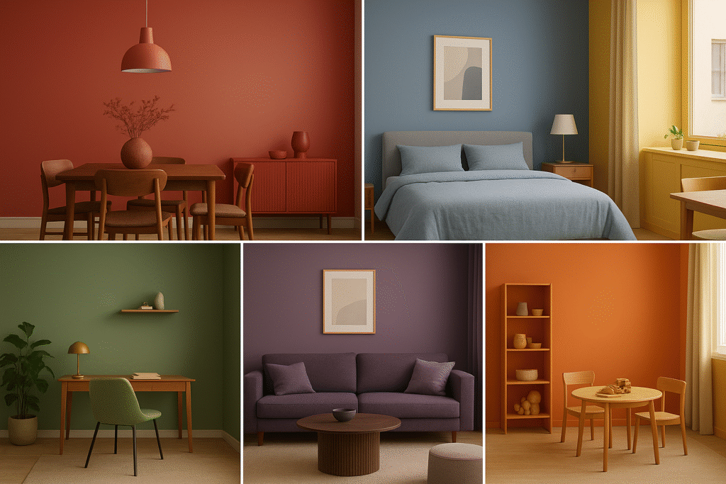
Red is a vibrant, bold color that represents passion, excitement, and urgency. Small touches create a lively focus and stimulate conversation, especially in dining rooms. But using too much red can cause stress and raise blood pressure. It’s an attention-grabbing color that should be used sparingly.
Blue
Often related to the ocean and the sky, the color blue evokes feelings of calmness, serenity, and stability. Blue has a cooling effect mentally and is believed to reduce stress and induce calming sensations. Thus, it is a favorite color choice for bedrooms, bathrooms, and home offices where focus, clarity, and tranquility are the priorities. However, too much dark blue in a poorly lit space can create a cold or somber ambiance.
Yellow
Some research participants felt that yellow’s bright sunny tones are naturally optimistic and energetic, and denote joy. Yellow is also an exciting color for innovation and creativity, and therefore can be uplifting. Bright yellows contain some focus and joy, but have to be used wisely, as too much yellow in saturation and quantity can invoke impatience or frustration. Lighter, buttery yellows are generally softer and most uplifting to all participants.
Green
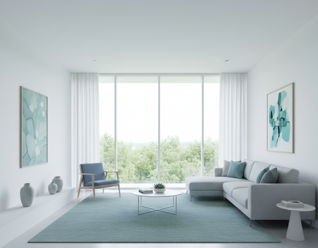
Green is rich with natural associations, conveying a sense of relaxation, stability, and revitalization. Designers consider green the most restful color for the eye, offering emotional harmony and well-being. Rely on a range of palette options, from gentle sage to dark forest greens; green may be one of the best colors for any space in your living area, sunroom, or study, providing a sense of development and security.
Purple
Purple has had a connection to royalty in history representing luxury, wisdom, and creativity. Due to its dual nature (calmness of blue and energy of red), purple can vary greatly in how it psychologically affects people. Darker shades like eggplant feel dramatic, rich, and sophisticated, while lighter lavenders and lilac to pastel purples feel soft, spiritual, and calming.
Orange
An inviting, cheerful, and highly noticeable color, orange blends red’s energy with the joy of yellow. Orange is energizing, approachable, and promotes conversation; you often see it in playrooms, gyms, or entryways for stimulating a sense of excitement and conversation. Like red, use it best as an accent color in most home spaces.
The Influence of Color Temperature and Space Perception
In addition to the feelings it evokes, color has an important physical impact on the way we interpret the size and warmth of a space. Designers depend on our innate ability to understand the visual effects of color temperature, which are classified as either warm or cool, to alter the perception of that space.
Warm Tones: Advancing and Intimate
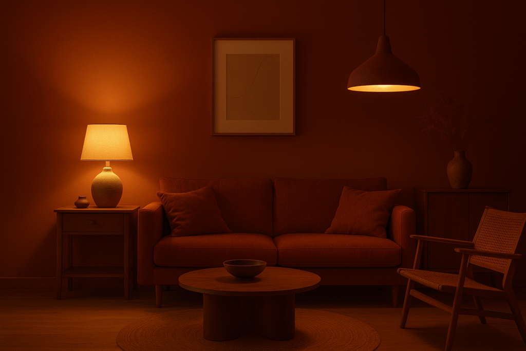
Warm colors such as reds, oranges, yellows, or warm neutrals such as terracotta are what is called visually advancing. This means they are either making something feel close or making walls appear closer. Color visual advancement can effectively be used in design applications.
- Designers use them to make large or open spaces feel cozier. It helps reduce the sense of emptiness.
- Their association with sunlight and fire, they in effect create a physical warmth for the occupants of a room, which makes them practical for use in colder climates or in North-facing rooms with little natural light.
Cool Tones: Receding and Expansive
Cool colors—including blues, greens, and purples—are visually receding. They cause objects and walls to appear further away, creating depth and distance.
- They are the essential tool for creating an effect of openness, spaciousness, and serenity, effectively making small rooms appear much larger and airier than their physical footprint suggests.
- Associated with water and sky, they provide a calming and mentally cooling effect, making them the perfect choice for sunnier rooms or high-energy environments like a gym or active kitchen.
Choosing the Right Palette for Each Room
Good design principles require the the color palette focus on the main function and the activity intended for the space. Designers align the psychological impact of the color to the behavior they want to promote.
Balancing Visual Comfort and Emotional Effect
| Room Function | Desired Mood/Behavior | Suggested Palette Strategies |
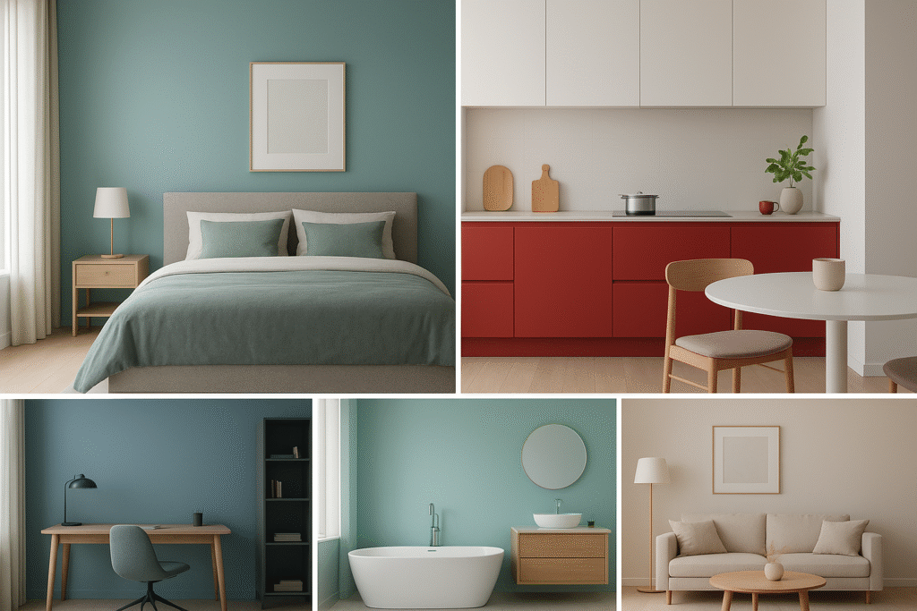
| Bedroom | Rest, Relaxation, Sleep, Intimacy | Prioritize cool, deep tones (navy, sage green) or soft, muted neutrals to promote a drop in heart rate and reduce stimulation. |
| Kitchen/Dining | Activity, Appetite, Socializing | Use warm, stimulating colors (red, orange, yellow) in moderation to encourage conversation and food consumption, balanced by clean, crisp whites. |
| Home Office | Focus, Concentration, Clarity | Utilize colors that promote cognitive function, such as soothing blues and greens, balanced with grounding grays and natural wood tones. Avoid highly distracting warm tones. |
| Bathroom | Cleanliness, Rejuvenation | Crisp whites and cool blues or aquas reinforce a sense of hygiene and calm, creating a spa-like atmosphere. |
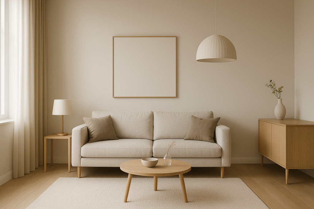
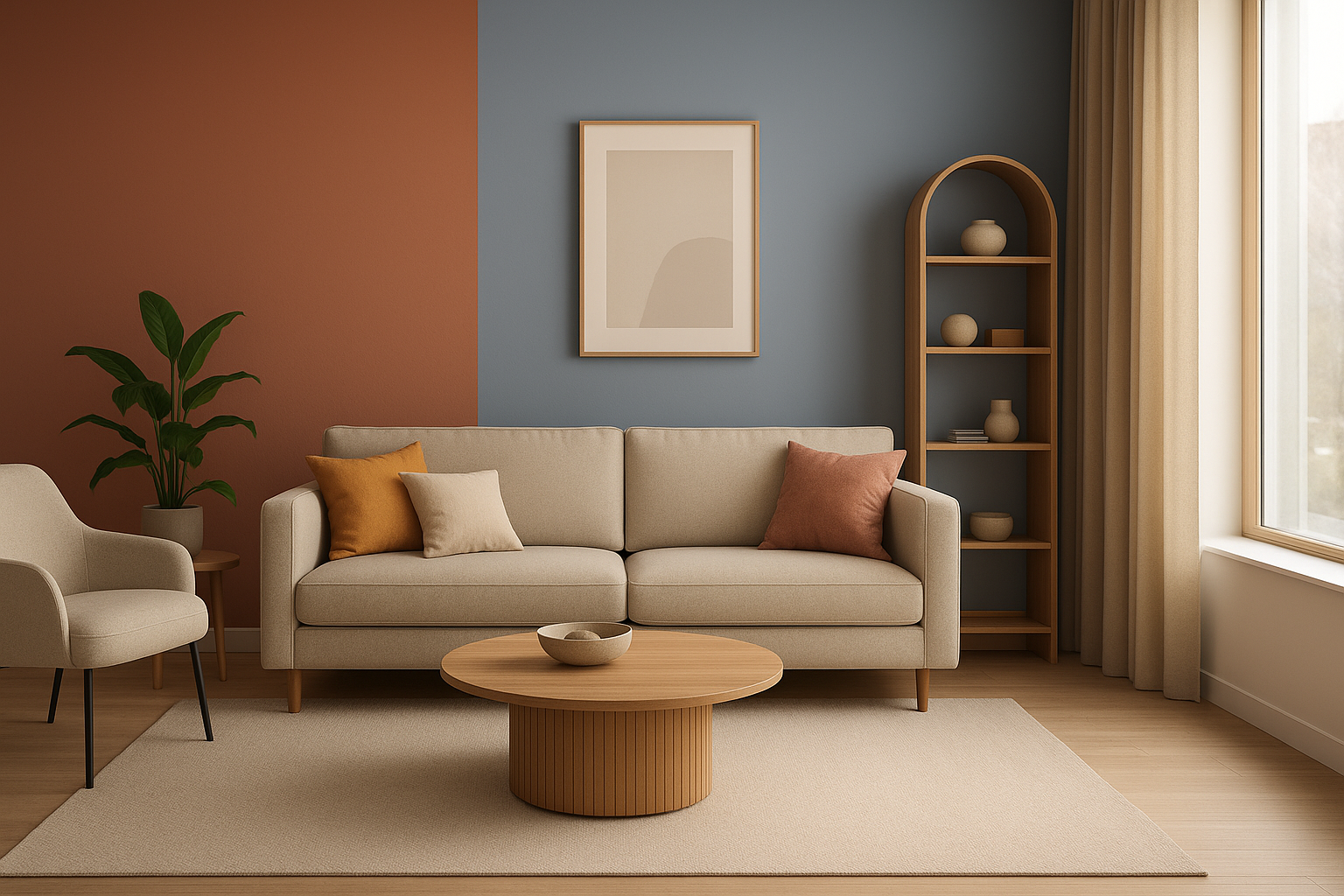
| Living Room | Comfort, Socializing, Versatility | Requires a flexible palette, often incorporating a neutral base for comfort, highlighted by two or three harmonizing accent colors to provide depth and conversation points. |
The Designer’s Palette: Balance and Harmony
A professional designer exhibits expertise not only in choosing colors, but in their combination and proportion.
Balancing Visual Comfort and Emotional Effect
It is uncommon to see a pure, saturated color used throughout an entire room. The craft of the palette is about blending and incorporating numerous elements for visual balance or to create solid psychology.
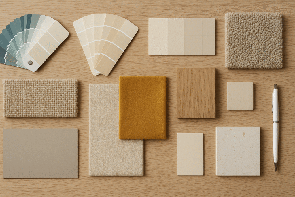
- Neutrals as the Foundation: Colors such as white, gray, beige, and taupe create the essential base for almost any cultured palette. They provide important visual space and grounding to allow certain accent color(s) to create the needed contrast and energy, without detracting from the space itself.
- Accents for Energy and Focus: Accent pieces are small, high-impact amounts of bright color (for example, a bright velvet throw or a bright colored chair). They add necessary stimulation and energy to a room so that it does not drift into a flat space but also do not disrupt the basic calmness of the room, given their limited use.
- Contrast for Definition:Incorporating contrasting colors (opposites on the color wheel) or contrasting light and dark shades provides important depth, and enables the distinctive architectural details to be easily recognizable. Contrast is what keeps a monochromatic room from feeling flat, and adds layers of interest.
Cultural and Personal Influences
While color psychology provides universal guidelines based on light and temperature, its application must be sensitive to both cultural context and personal history.
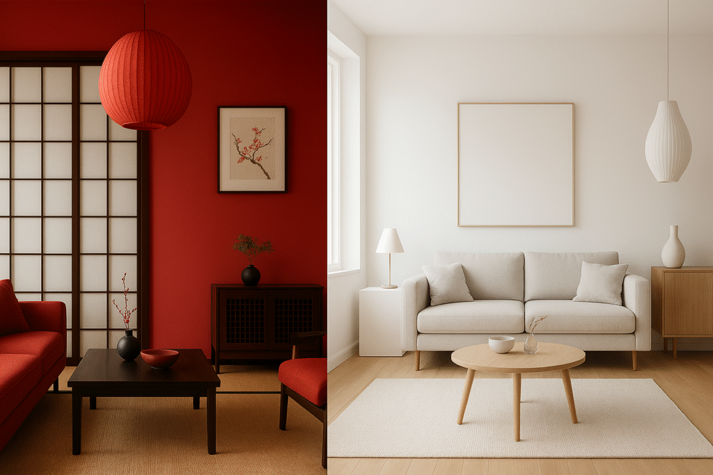
- Cultural Meanings: The symbolic meanings of colors are not universal in meaning. For example, in many Western cultures, white represents purity and peace, while in parts of Asia, it is the traditional color of mourning. Alternatively, the color red may represent caution in the West, but in China, it is a heavy symbol of luck, celebration, and prosperity. Designers must understand a client’s culture. It helps them avoid color meanings that send the wrong message.
- Personal Experiences: Moving past cultural influences, personal life experiences also shape people’s color likes or dislikes. For example, a client may have had a traumatic childhood experience in a room painted a specific color of green and may experience anxiety when encountering that color, irrespective of the color green’s universal calming effects. Therefore, part of a successful design process, for any space, always includes an in-depth, empathetic conversation with the client about their color memories and associations based on emotional responses to those colors.
Conclusion
Color is more than just paint on a surface. It is the most striking and understated alternative design language. Color is our ability to articulate comfort, generate productivity, and foster serenity. Understanding color psychology elevates interiors from a room full of furniture and walls to a thoughtfully designed, sophisticated experience that adds value to the lives of its inhabitants. When an interior designer intentionally selects and balances their palettes, they can create the wordless ability of color to shape an ambiance, enhance functionality, and create space that engages the human spirit.